The eventual decline of oil production in Saudi Arabia will likely have a profound impact on all of our lives. This event will result in energy shortages around the world, and depleting oil supplies will be bid up to higher and higher levels. Poor countries will no longer be able to compete, and they will be the first casualties of oil depletion. The richer countries will bid against each other for the remaining supplies, and if the depletion rate is high enough we will be in for some very tough times. The Saudis say they have plenty of oil. However, there are a lot of skeptics.
So, I am very interested in understanding what’s going on inside Saudi Arabia. One thing is certain: Over the past year their oil production has declined. I think up until now the reasons they have given for reducing oil production – which they say is entirely voluntary – have been consistent with what the market was calling for. So, I believe that their decline over the past year has been voluntary.
Other researchers disagree. Books have been written calling into question the claims of Saudi reserves. Matt Simmon’s book Twilight in the Desert was devoted to this subject. Many people have come up with models for attempting to predict the demise of Saudi oil production. This essay, also posted to The Oil Drum, takes a close look at one popular model that is often used as evidence pointing to an imminent peak for Saudi, as well as world oil production.
In Part I, I take a look at the model by feeding it historical Texas oil production data and observing the predictions. In Part II, I will feed it historical Saudi oil production data and observe the results.
Part I – Texas Myths
Like Cindy Crawford, I have done quite a bit of modeling in my career. However, mine has been in front of a computer. There are various types of models. They can be empirical, such that you curve fit data without having a clear explanation of the underlying mechanisms. Or they can be theoretical, in which the system is modeled according to the governing scientific principles and mathematical equations.
However, one thing is critical to keep in mind. If you are going to use the model for forecasting, the model must be tested. Testing the model is called “validation”, or sometimes “back-casting.” This involves feeding the model real data, and observing how well the predictions match up with the observations. If the predictions match up on a consistent basis, and any large variations are explainable, you have the makings of a predictive model. If you have not validated your model, or if you have attempted to validate it and found that the predictions were inconsistent, the model should be used with caution (if at all). In this essay I have done some back-casts on the Hubbert Linearization (HL) model and attempted to use it to make predictions using historical data.
The background of the technique is outside the scope of this essay, but Stuart Staniford has provided details here. The HL model is a hybrid model with empirical parts and theoretical parts. Jumping past the differential equations involved, a basic explanation of the modeling technique is as follows: If one plots the cumulative oil production of a region (Q), versus the yearly production (P) divided by the cumulative production (P/Q), a plot can be made to extrapolate and find the ultimate recoverable reserves (URR) for the region (Qt). You can see a number of HL examples in Stuart’s essays When Does Hubbert Linearization Work? and Extrapolating World Production.
Qt and Peak Production
I am unaware of a case in which a country has completely run out of recoverable oil and had Qt verified by the HL method. However, there are plenty of examples in which a region’s production profile follows the expected path determined by the HL. There are also many examples showing that a region’s production peaked at very close to 50% of Qt. Quoting from an article by oil geologist Jeffrey Brown and “Khebab”:
With time, a HL data set starts to show a linear progression, and one can extrapolate the data down to where P is effectively zero, which gives one Qt, or ultimate recoverable reserves for the region. Based on the assumption that production tends to peak at about 50% of Qt, one can generate a predicted production profile for the region. The Lower 48 peaked at 48.5% of Qt.
Some areas have tended to peak at a higher % Qt than others. It is commonly claimed that Texas production, for example, peaked in 1972 at 57% of Qt (the reason for the qualifier will become apparent later in the essay). The fact that Texas peaked later than most regions is sometimes explained by the fact that prior to 1972 Texas was the swing producer, and production was regulated. This situation is similar to that of Saudi Arabia, so Texas is often used as an analog for predicting Saudi Arabia’s peak. So far, so good. But the astute reader may wonder “Can the value of Qt change significantly over time?” If the answer is “yes”, then the inevitable follow-up is “Then how can I be confident in using the HL to predict a peak?” I will attempt to answer these key questions by looking at the evolution of the HL for Texas over time.
Evolution of the Texas HL
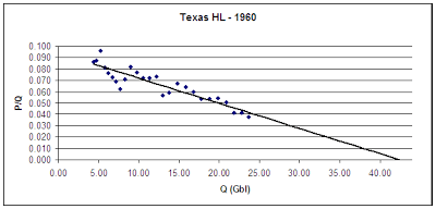
I have retrieved historical Texas oil production records and modeled a series of HLs at various time periods. According to a 1956 Hubbert paper, (1) Texas had extracted approximately 4 billion barrels of oil prior to 1935. Beginning in 1935, we have annual production statistics that take us through the end of 2006. (2) Therefore, we can construct a series of HL curves. To avoid any bias on my part, I had Excel extrapolate the line and make the forecast once there was a relatively smooth trend. Let’s take a snapshot from 1960:

Figure 1. HL of Texas Oil Production Using Data Available in 1960.
As you can see, we have a nice trend. In fact, the latest 10 points are reminiscent of today’s HL of Saudi Arabia. The points have settled down and are staying pretty close to the line. So, what could we say in 1960? Qt as determined in 1960 from the intercept above is 42.5 billion barrels (Gbl). Texas crossed 50% of Qt in 1957, and by 1960 was at 56% of Qt – almost the same value as today. Surely peak was imminent. In fact, if you look at the data, Texas clearly peaked in 1956 at 1.079 MM bbl/day. By 1960, Texas was down to 892,000 bbl/day. It had undergone an annual decline of 5.5% for 4 years, and was well past 50% of Qt.
In 1960, we could have said “Texas oil production peaked in 1956, as predicted by the HL method.” But as we know, that’s not at all what happened. That would have been forecasting the peak 16 years too early. So let’s fast-forward to 1970:
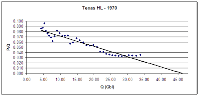
 Figure 2. HL of Texas Oil Production Using Data Available in 1970.
Well, that’s not very helpful. Our Texas HL in 1970 is much more muddled than in 1960. The 1956 record was broken in 1968 – twelve years after the 1960 analysis indicated a peak. We are starting to see some points rise above the line and extend Qt out further than was implied in 1960. The trend line that Excel drew is now forecasting 46.25 Gbl as our URR. That puts production in 1970 at 73% of Qt. The last 14 years had been spent well above 50% of Qt. But, the last 4 points – starting in 1967 – seem to indicate that Qt may end up being even further out than we thought. Now remember, it’s 1970. What exactly about this curve would indicate that we are 2 years from peaking?
Let’s jump forward now to 1980:

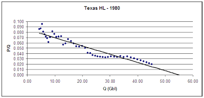
Figure 3. HL of Texas Oil Production Using Data Available in 1980.
Qt continues to grow. Excel is now forecasting Qt at 55.5 Gbl. The trend toward a higher URR is evident. The last few points imply that the forecast will grow to 57 Gbl. If so, our 1980 HL would put Texas’ 1972 peak at 63% of Qt. So, not only do we see Qt growing with time, we see that the % of Qt when the 1972 peak occurred is getting smaller. So, can we forecast the 1972 peak by 1980? No. We have already seen a case where the 1956 production record wasn’t broken for 12 years. The % Qt during that time was well over 50%. The % Qt in 1970 had climbed to 73%. Yet that still didn’t enable us to call peak. On what basis could we have done so in 1980? We have now gone through 24 years in which we could say “peak might be here.” To suggest that we could have made any other forecast at that time is wishful thinking.
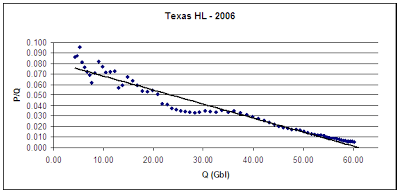
So let’s skip to present day – end of 2006:
 Figure 4. HL of Texas Oil Production Using Data Available in 2006.
Qt is now at 62 Gbl, but look at those last few points. They are once again pointing to a higher Qt. Some time in the 1980’s, as production continued to fall, we could have finally said “1972 was the peak.” But the % of Qt for the 1972 peak is still a moving target. Today, the 1972 peak clocks in at 58.3% of Qt – not far from the value in 1960. In 1980 it was 63% of Qt, and in 1970 it was 73% of Qt. Therefore, claims of “no examples of large producing regions showing sustained, steady increases in production past the 60% of Qt mark” are clearly wrong. Texas showed steady production increases past the 60% mark of Qt, because it reached that level in the early 1960’s. Texas even showed production increases past 70% Qt, as it reached 73% two years prior to the production peak.
Implications for Saudi
So, is Saudi like Texas in 1956, or is Saudi like Texas in 1972? Or is it like neither? The HL can’t tell us that. This essay should make clear that confidently predicting a Saudi peak on the basis of the Texas HL is nothing more than an exercise in faith-based forecasting. The only reason that the Texas HL looks as it does is because we have decades of data points following the Texas peak. But what is missed is that the HL has changed greatly from the time Texas actually peaked. So the Texas HL at its peak looked nothing like the Saudi HL of today.
It is invalid to use three decades of hindsight for refining the Texas forecast, because we clearly don’t have the same option with Saudi Arabia. Yet some argue that the Saudi peak can be forecast with confidence using the knowledge obtained from the case of Texas – a region in which the uncertainty of the method spanned almost 3 decades.
So, the HL has shown that it is good at forecasting the past, but can be very unreliable for predicting the future. In Part II, we will examine the evolution of the Saudi HL over time.
Notes
For those who may be unfamiliar with my position, this argument in no way diminishes my belief that we need to take action right now concerning oil depletion. I am merely evaluating one of the tools that is used to forecast peak, and trying to determine whether that tool can give us any precision on forecasting a peak in Saudi Arabia. My conclusion is that it can’t, but we will look at the specific case of Saudi Arabia in Part II.
I believe that by summer (barring recession) we should know one way or another, because the market looks to be undersupplied at the moment. I think Saudi will be called upon to open the taps by summer. If they can’t, look out.
References
1. Hubbert, M. King. Nuclear Energy and the Fossil Fuels. Paper presented at an American Petroleum Institute meeting in San Antonio, Texas. March 7-9, 1956 p. 10.
2. Oil Production and Well Counts in Texas 1935-2005, Railroad Commission of Texas, Accessed March 2007
Texas was the swing producer until 1971, and had its output regulated by the Texas Railroad Commission. I’m sure that a field throttled back to 60% of its full output will create a false signal in the HL method. Did you allow for this?
Reality Czech
Ah, but Saudi has long been a swing producer as well. That’s why proponents of the method suggest that the Texas HL can foretell what’s happening in Saudi. What I showed here is that it can’t. I tried to validate the model by feeding it real data. It failed that validation.
Cheers, Robert
Have you ever looked at a chart of Saudi oil production? [link]
Have you ever looked at a chart of Saudi oil production?
Sure, but the key debate is all about whether they have been reducing production to keep prices up and to meet OPEC quotas, or whether they have actually peaked.
Cheers, Robert